

Look What Mid-Caps Are Doing
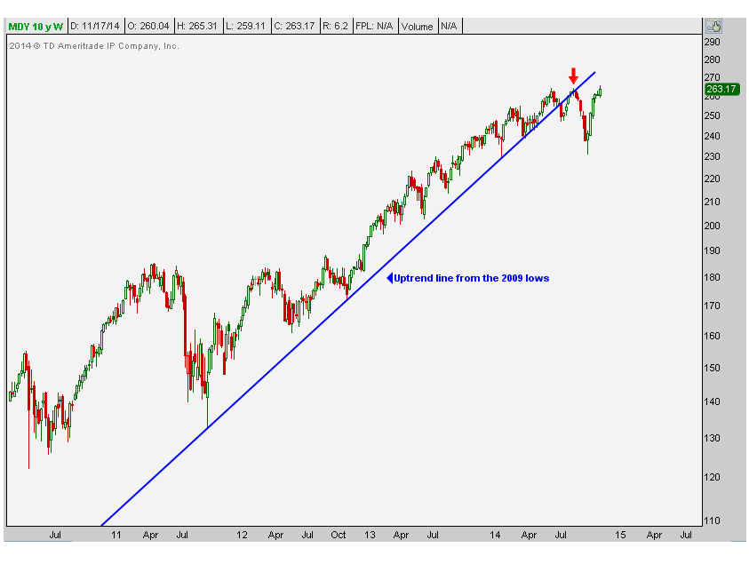
A little over two months ago we did a multi-timeframe review of the Mid-Cap 400 just as prices were retesting the broken uptrend line from the 2009 lows (see here). This was back in September just before prices of the index corrected by over 10% in a month. Not only was the uptrend line broken, but when we looked at the short-term timeframe the daily chart was putting in what appeared to be a double top with momentum simultaneously diverging negatively. After some time has now gone by I think it’s worth pointing out some interesting developments. We are basically at the same price that we were in mid-September which was the last time I wrote about the mid-caps on this blog. Remember these are companies whose market capitalization is between $2B – $10B, and includes names like 3D Systems, Foot Locker and Cheesecake Factory.
These are the same two charts we looked at back in September which suggested staying away or outright shorting the index. The first one is a weekly candlestick chart showing prices breaking the uptrend line that originally got us worried a few months back. Broken uptrend lines don’t necessarily mean that a trend has reversed, but more often than not they signal a change in trend. In this case, we went from and uptrend to more of a sideways trend that has worked itself off through time rather than through a structural downside correction. We prefer this.
The next one is a closer look at what’s happening here. This is a daily candlestick chart showing prices running into this 260 area for what is now the third time. As someone who looks at thousands of charts a week, I can tell you that triple tops are extremely rare, if they even exist at all. What occurs more often is that the third test of resistance (or support if in a downtrend) usually leads to a fourth or fifth test that eventually gives way. The way I look at it, the more times that a level is tested the higher the likelihood that it breaks. I would argue that this third test is bullish and calls for higher prices to come.
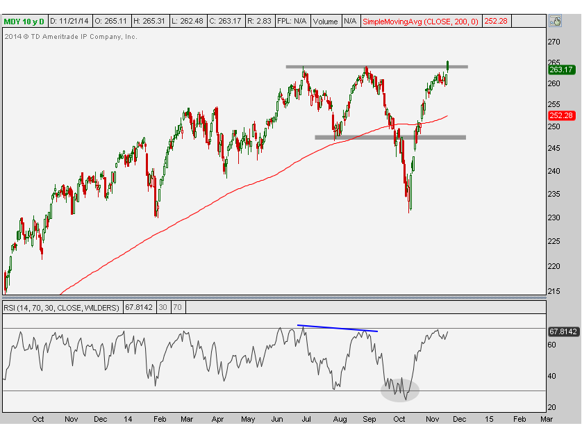
This failed breakout last week is further evidence that we might still need some time. In fact, I would actually welcome it and consider some time up here to be a very bullish development. Something else that we’re looking for is momentum to hit overbought conditions. Back in September the bearish divergence as RSI made a lower high while prices ran into resistance was one of the reasons for getting bearish. The fact that momentum hit oversold conditions on this sell-off in October keeps it in a bearish range. I would definitely want to see overbought readings and prices to hold above the highs from this year before getting overly excited on the long side.
I consider this to be really healthy action and something I would want to own above and only above the highs from 2014. It seems like a clean top to me. Once we break through, and momentum confirms, I like this one.
Members of Eagle Bay Solutions receive updates on this chart along with all of the other major averages every single week. This report includes both daily and weekly charts, momentum analysis, pattern recognition and price projections. Sign up for our US Averages & Interest Rates package here.
Recent free content from J.C. Parets
-
 Here’s Way I think Rates Are Heading Lower
— 11/12/15
Here’s Way I think Rates Are Heading Lower
— 11/12/15
-
Support & Resistance 101: Apple Edition
— 11/10/15
-
 Video: Technical Analysis Webinar by JC Parets
— 10/01/15
Video: Technical Analysis Webinar by JC Parets
— 10/01/15
-
Find Your Edge: The Autumn 2015 AlphaShark Trading Symposium with a Presentation by J.C. Parets
— 9/25/15
-
Can Financials Correct 30% From Their Highs?
— 9/24/15
-
{[comment.author.username]} {[comment.author.username]} — Marketfy Staff — Maven — Member

- 1 Campus Martius, Suite #200Detroit, MI 48226
- +1 877 440 9464