

Weekend Review and Watchlist
These last few weeks have given those who like to follow a narrative plenty to work with as Greece, the Fed, currency wars, and commodity prices all continue to feature heavily in their market commentary. For those of us who prefer instead to follow price, the message of the market wasn't any easier, as a series of gaps and reversals this week made navigating a true course difficult. Volatility is back, and on the major indices we again find ourselves close to important support levels and potentially registering another 5% pullback from the highs.
As I commented on Friday, the thing with market pullbacks is they always feel worse than they look. That doesn't mean you should be complacent, far from it, you always need to manage risk as if your biggest drawdown is ahead of you, but you can also benefit from putting what happens on a day-to-day basis into the context of your timeframe and methodology.
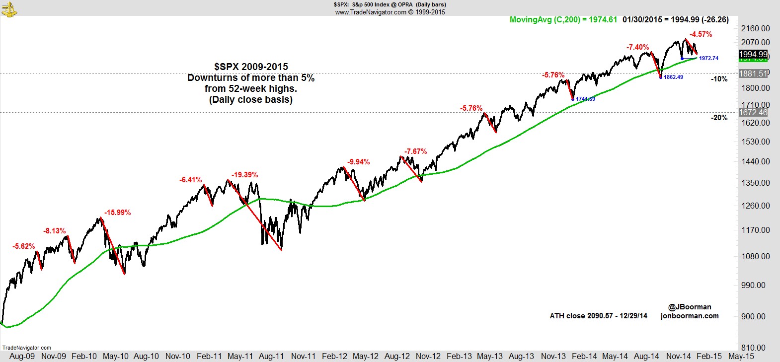
With the feverish anticipation that has evolved over the last two years around each potential correction or bear market, I made the above 'Correction Roadmap' a permanent fixture on my blog a few months ago and update it each weekend.
Let me reproduce here what I say about how to best use it:-
"This chart does not in any way depict targets or predictions. It is to help give context for whatever price action may unfold. As you look at this chart you need to view it from the perspective of the strategy you follow, the timeframe in which you operate, and the risk it entails.
How big (or small) does current price action look to you in context of the overall trend?
Look how far we could correct and yet still be in a longer-term uptrend. How would a move to each of those levels impact your account? How would it impact you emotionally?
If you’re struggling to deal with 5% market pullbacks, or the thought of a 10% decline terrifies you, you may be taking too much risk, trading too short a timeframe, or have unrealistic expectations of market volatility. For potential losses try to think in terms of what’s possible, for potential gains, what’s probable.
Whatever course the market takes, you never want to be in a situation where you don’t know what to do. Having a plan, a process, can help determine in advance what action to take and help you navigate any eventuality."
Subscribers to this service and long time followers will have already seen how following a modest pullback of around 5% we've often seen a flurry of exits triggered and our cash move quickly up to around 20%-30%. Then when the market fails to follow-through to the downside and the entries trigger we build the portfolio back up.
That can leave a temporary shortfall in performance but each time we make it back up through staying with the leading stocks in the subsequent rally, and we know if we ever do get that follow-through to the downside the gap will then be in our favor by a significant margin, with no new entry signals for our cash as the market continues to slide.
As a reminder of what that can look like, here's how the Correction Roadmap would have looked over the 6 years prior...
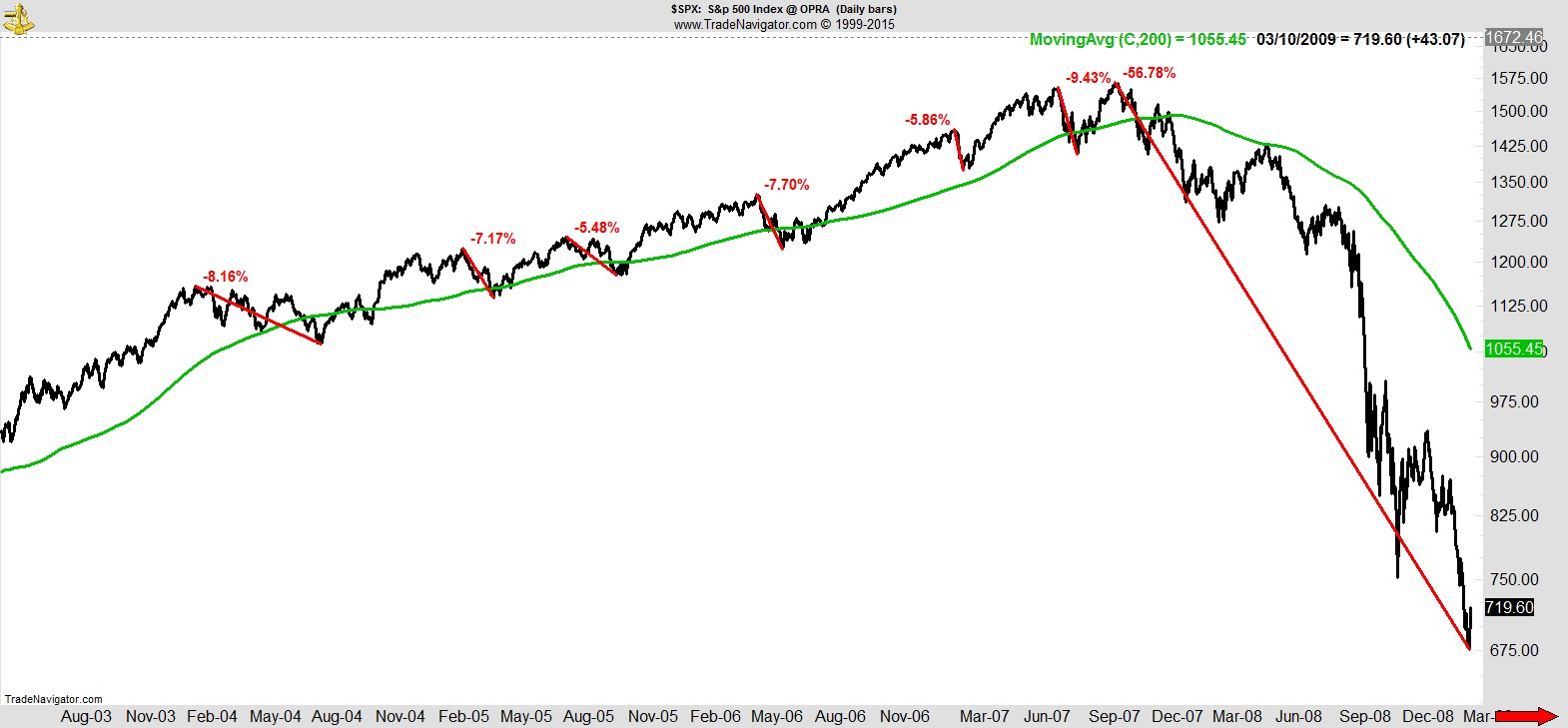
...and here's the six years prior to that...
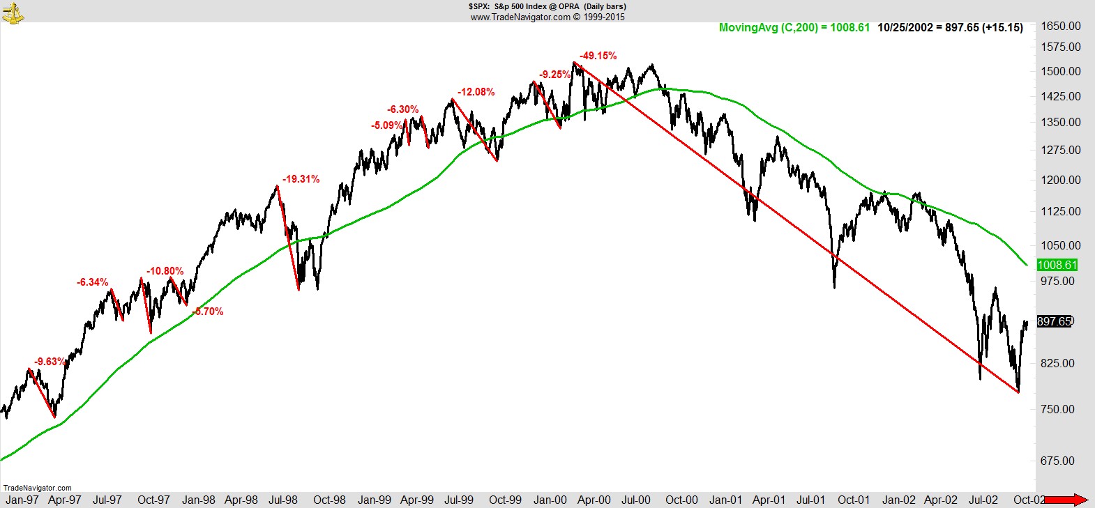
With the risk management we have in place, when those kind of declines happen we avoid the worst of it and are then well placed for whenever the market begins to improve and ultimately resumes its longer-term uptrend.
As always, the message is corrections and bear markets happen, but you don't need to anticipate or predict them in order to avoid the worst of the damage they cause, just as you don't need to predict an uptrend to benefit from it.
Let your winners run, cut losses, manage risk.
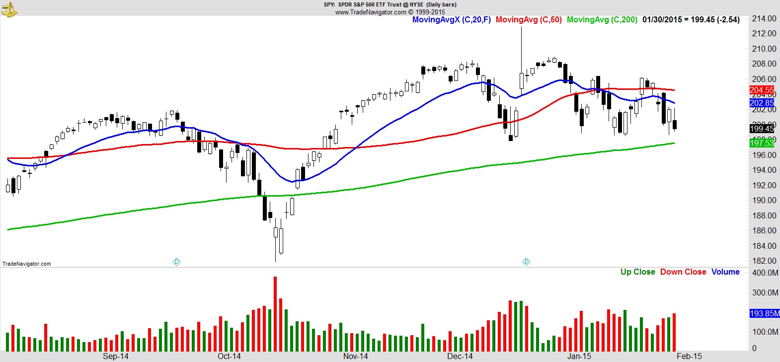
With that context firmly in our minds let's cut back to this week and where we stand on the S&P 500 using the $SPY ETF as our guide:-
Clearly that's a big level coming into view. A confluence of previous support levels, as well as the 200-day MA. For the record, the equivalent levels on the S&P cash index are the 12/16 close of 1972.74, and 1974.61 for the 200-day MA.
The recent market deterioration is perhaps best shown by the Dow chart below, with three lower highs and lower lows in place, a downtrend by any definition, but clearly over a relatively short timeframe.
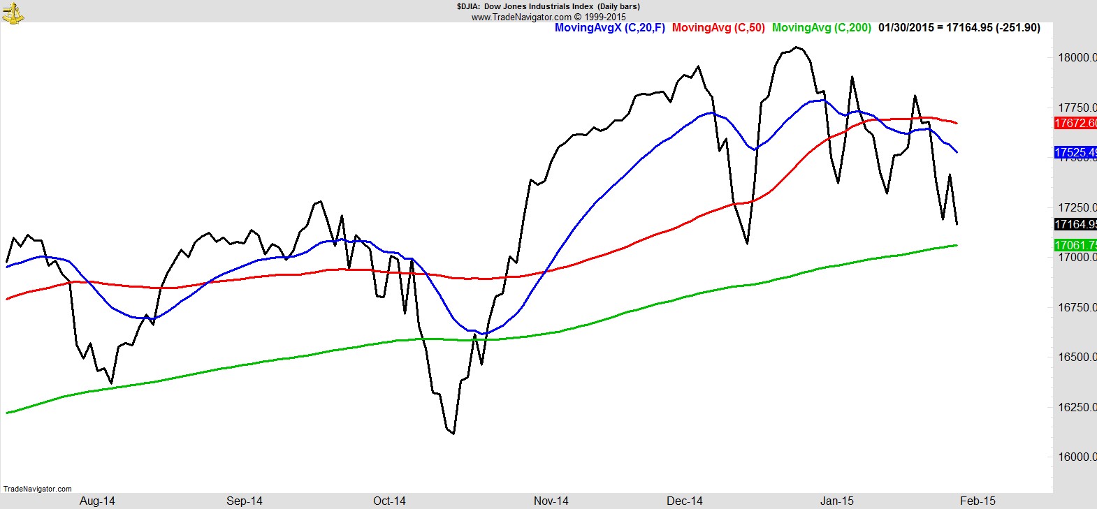
I know the Dow isn't everyone's favorite index given how it's constructed and priced, but it's the one that makes the headlines when things get serious, and similar to the S&P the big test will be that December low which coincides with the 200-day moving average.
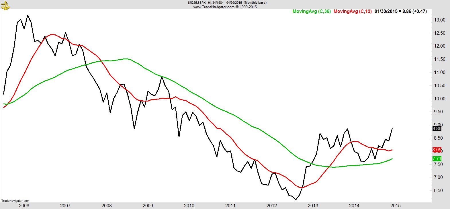
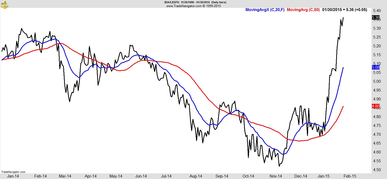
Previously when US markets have fallen, a quick look around the world was enough to bring comfort it was still the best market to own on a relative basis. Now, not so much.
The late selloff Friday which brought January to a close was also enough to ensure the Nikkei reached its highest monthly close in nearly 5 years relative to the S&P.
It was a similar story with Germany which continues to outperform.
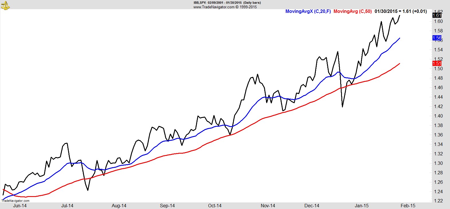
Within the US market there's a handful of sector candidates for the 'last man standing' contest. Utilities and Consumer Staples have been running efficient campaigns without ever being very popular, but the one that everyone still seems to clamor for is Biotech. Shown below, relative to the S&P, it's still the standout sector to me, but we know that can change quickly.
Let's quickly run through the nine S&P Sector SPDRs to give you some broader context.
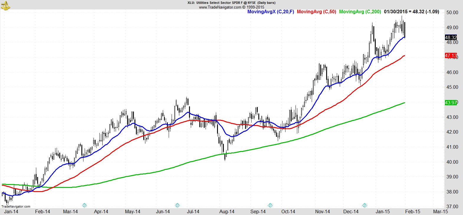
Utilities finally got hit hard enough to close below its 20EMA, but it's the only one of the nine still above its 50-day.
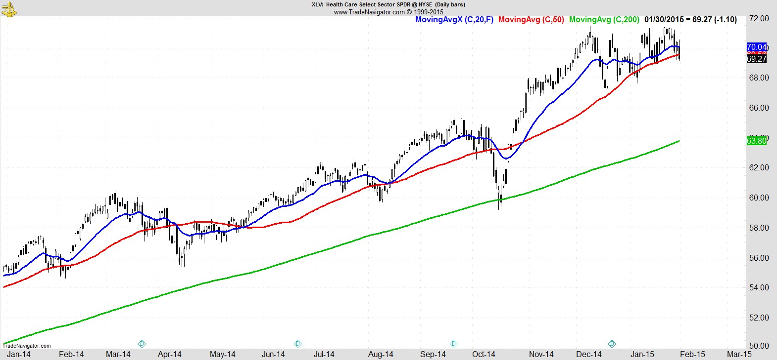
I'm putting Healthcare second, which closed below its 50-day but hasn't as yet put in a lower low.
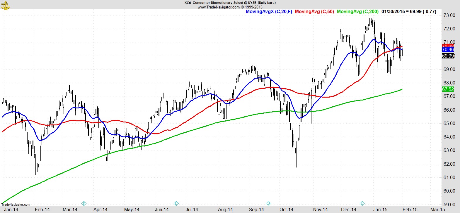
Next comes Consumer Discretionary which arguably held up relatively well but still remains below its MA's which have crossed over...
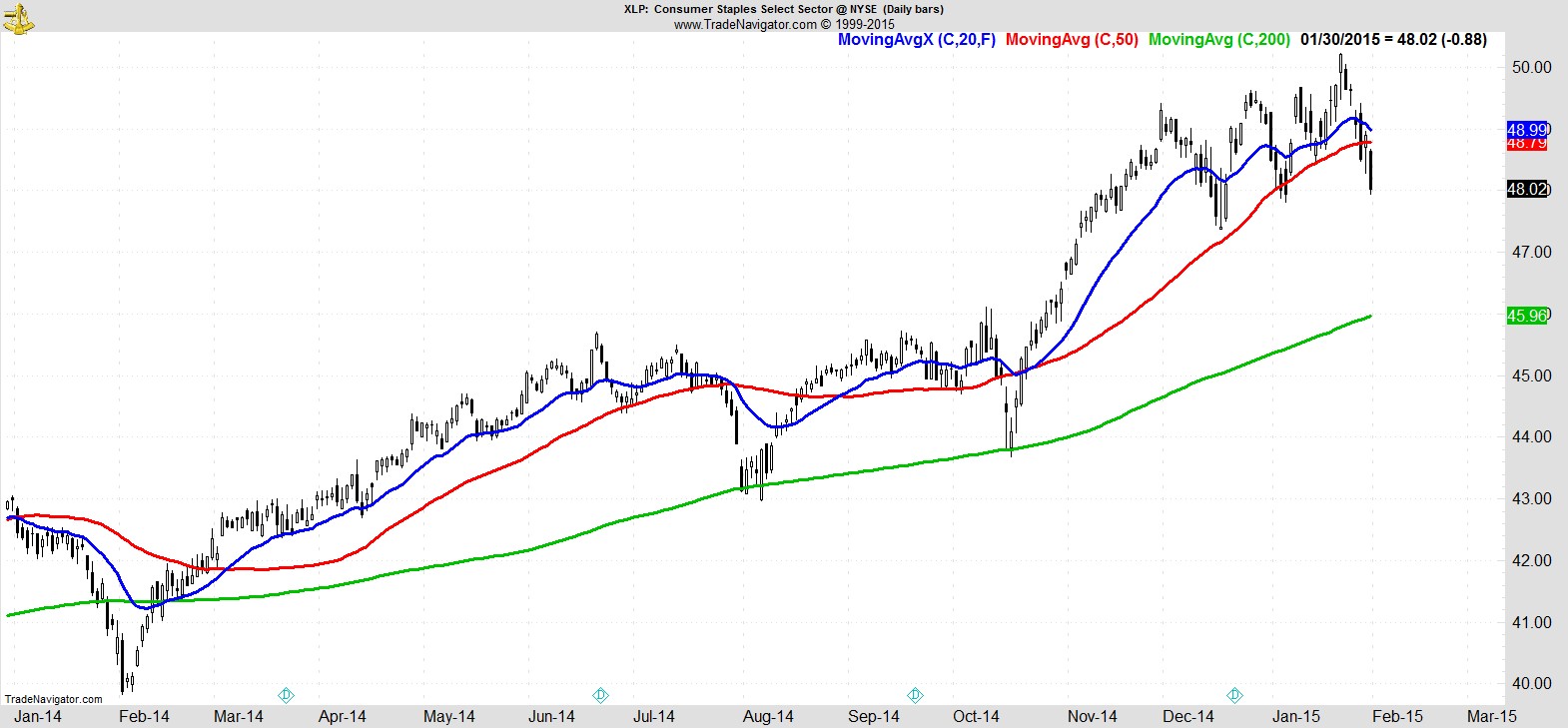
...whereas Consumer Staples put in a much bigger break.
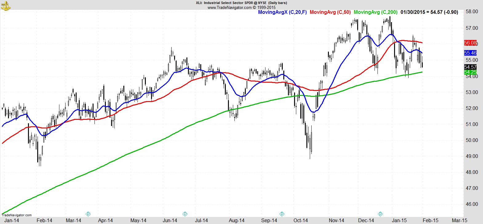
Industrials are coming in for another test of the 200-day MA...
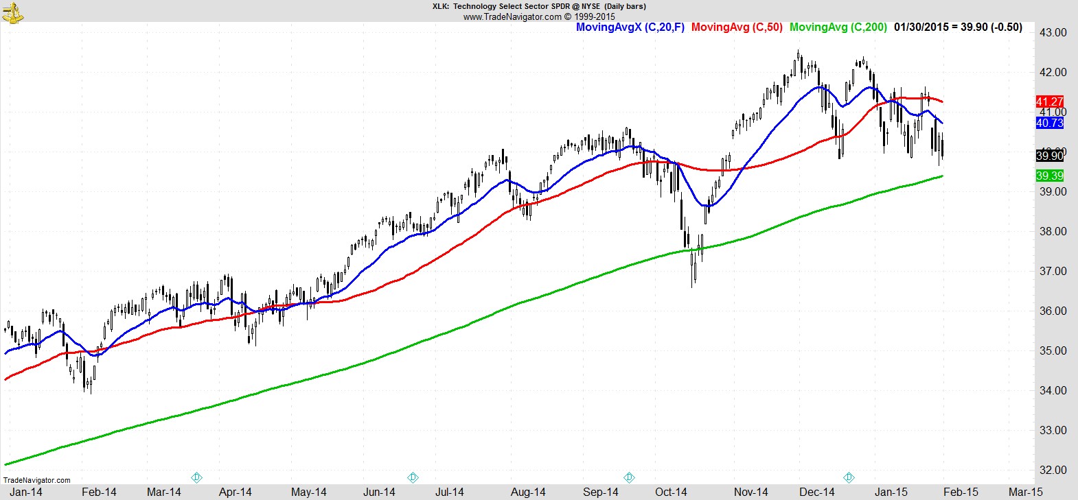
...as is Technology...
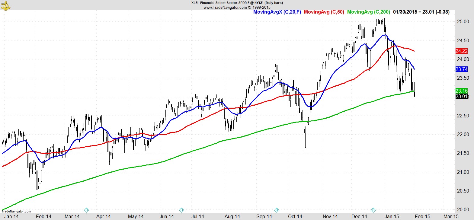
... while Financials already had an ugly break of theirs...
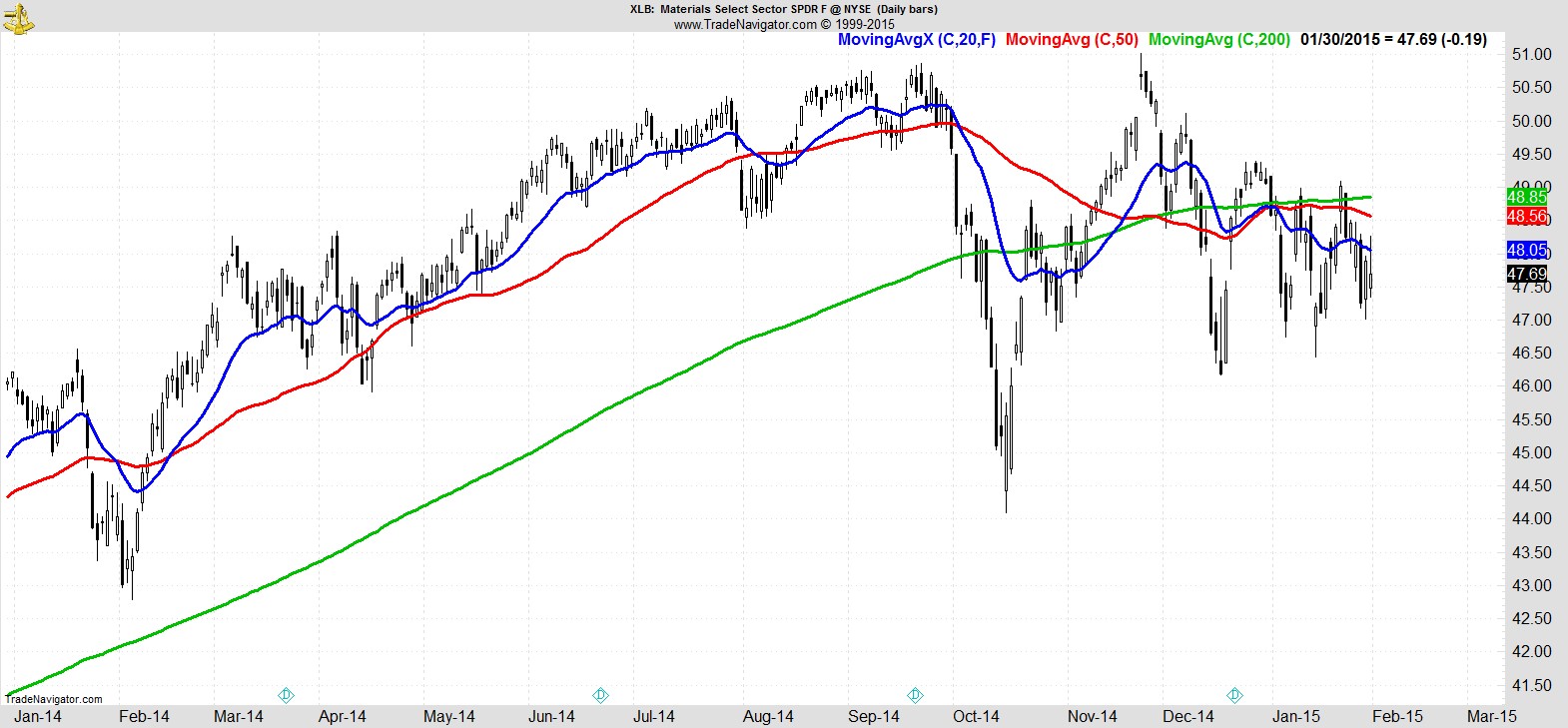
...but they still don't look as ugly as Materials...
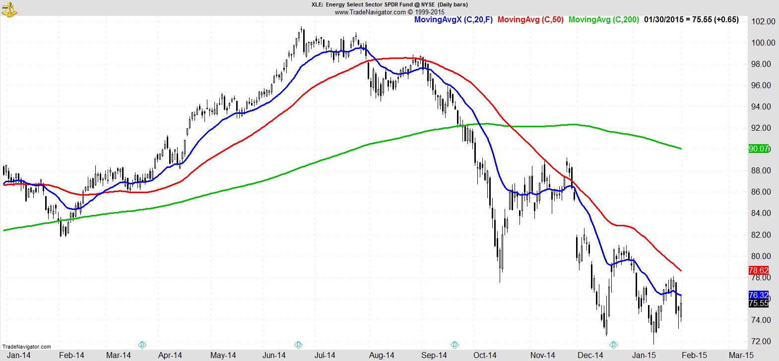
...or poor old Energy.
.
In our Marketfy portfolio this week we had two exits and two new entries. Of our 13 current holdings, 9 are still within 4% of their recent highs, and all but 3 of them are still above their 20EMA. Exiting our weakest names and staying with the leaders has helped to limit the damage in this recent selloff and leave us with a loss of just 1.1% for the portfolio in January versus -3.1% for the S&P 500.
The deterioration in the broader market definitely made an impact to our watchlist this week, as although there are still plenty of names, many of them now have a bit more work to do to set up fully, rather than being the ready-made alternatives they usually are.
Although healthcare and technology still have a good showing, their numbers have both decreased making consumer discretionary the most dominant sector currently.
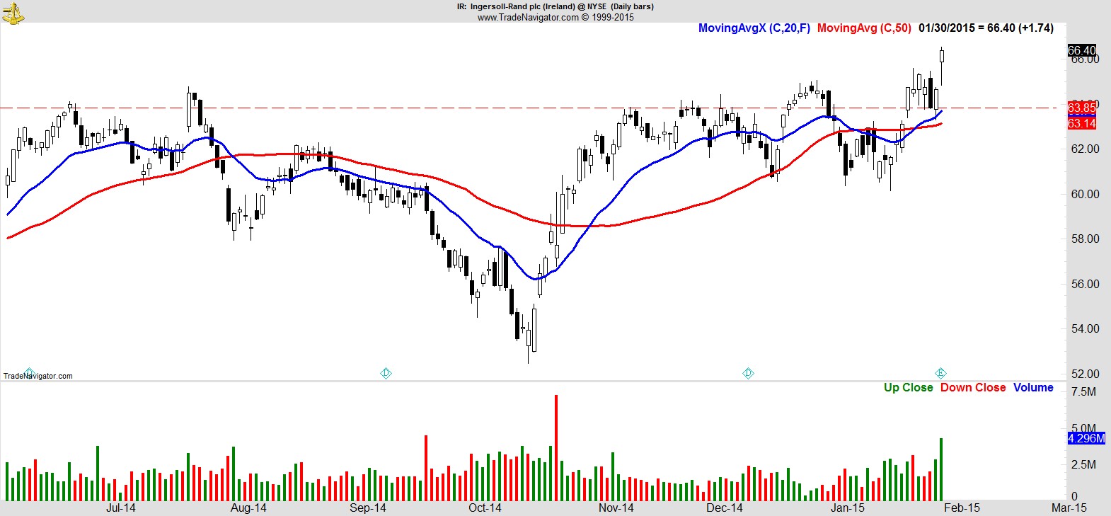
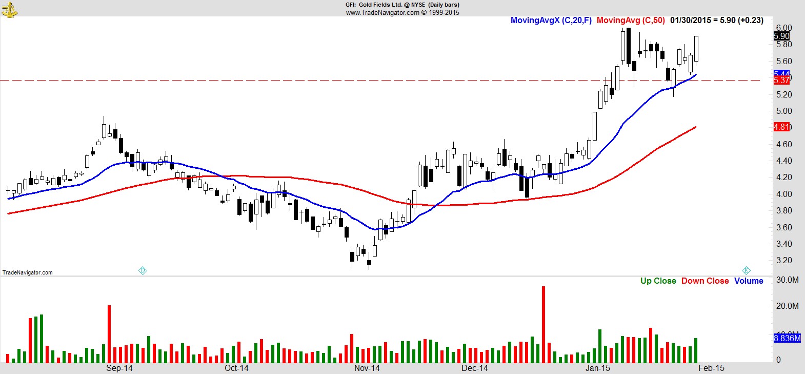
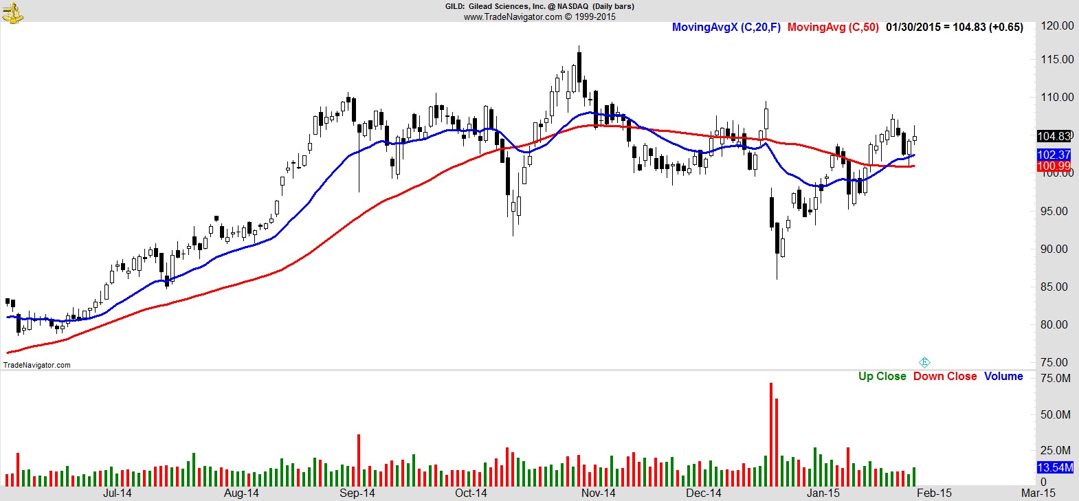
Here's a sample of just 10 of the 26 names:-
$IR
.
$GFI
.
$GILD
.
$REGN
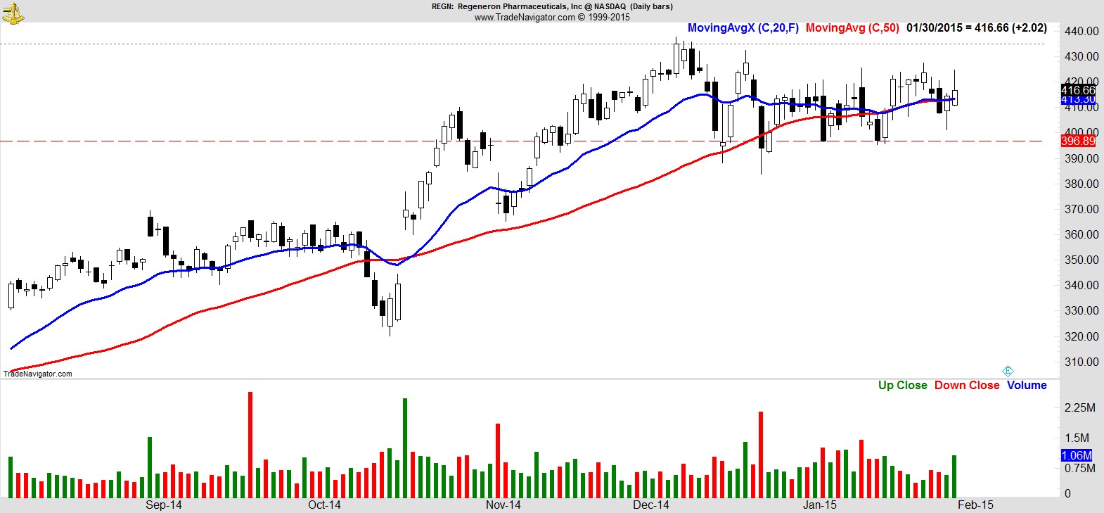
.
$PSEM
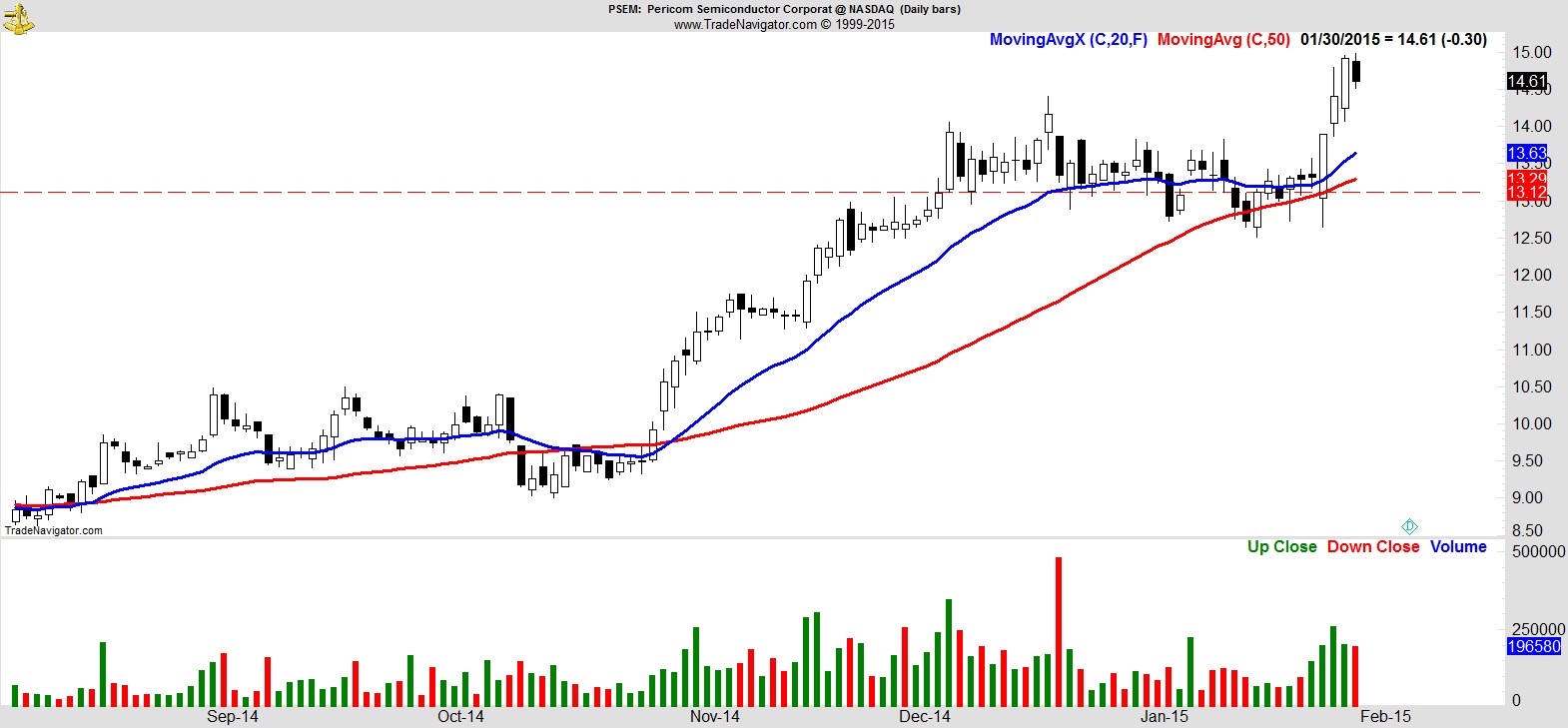
.
$AAPL
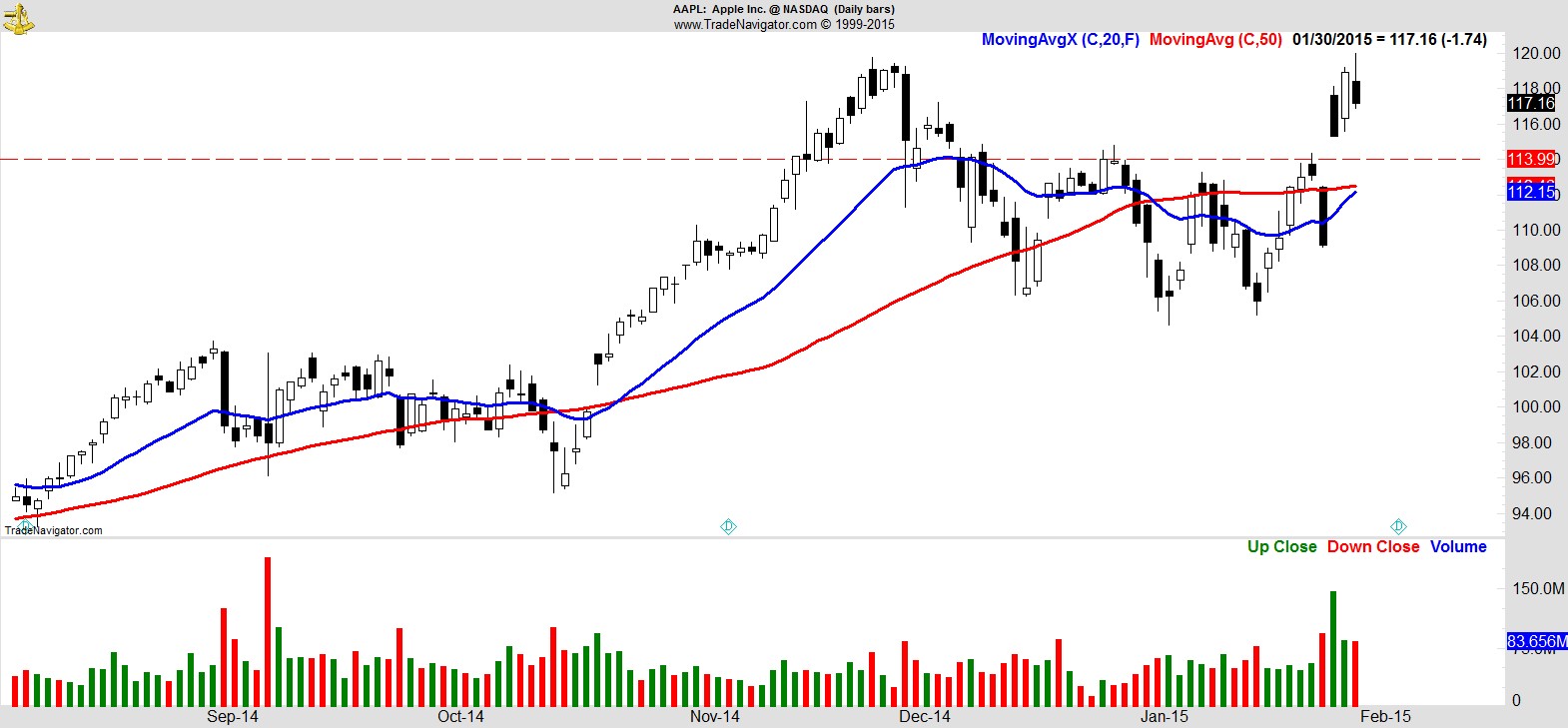
.
$LOW
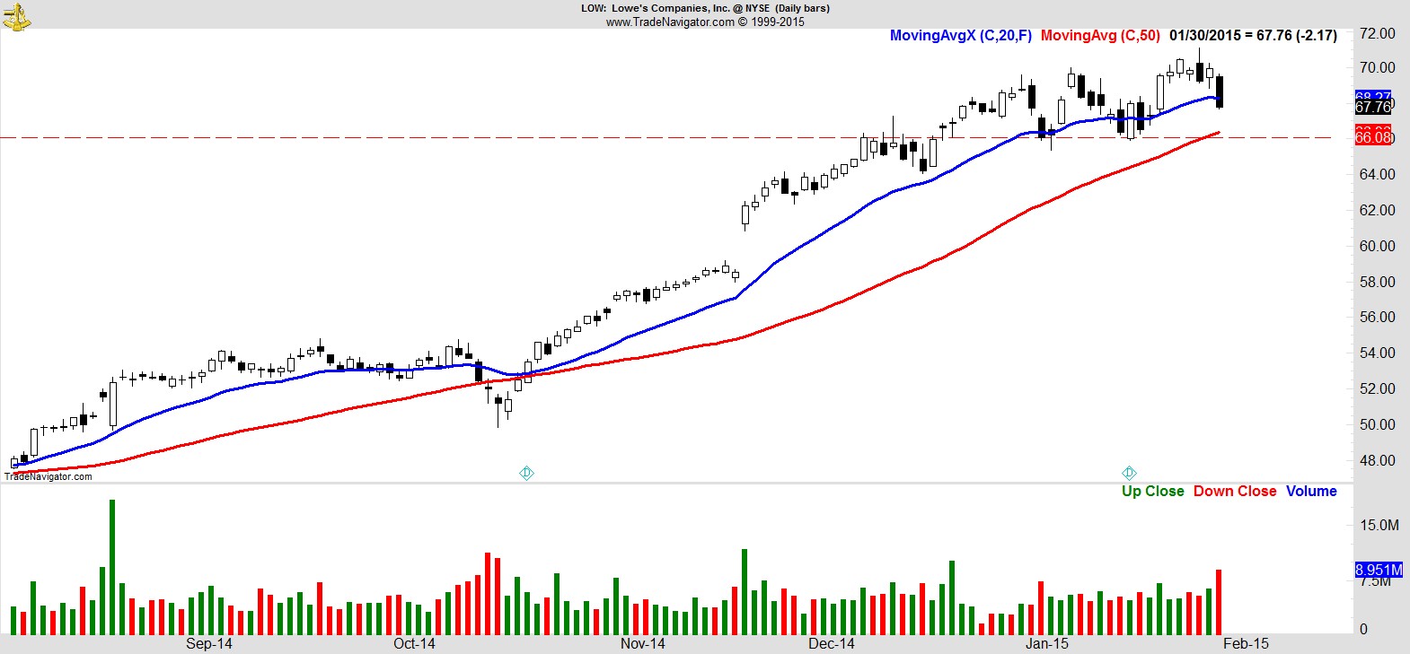
.
$EA
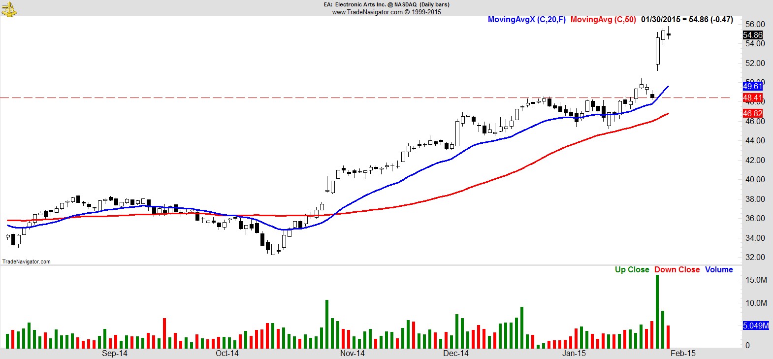
.
$ULTA
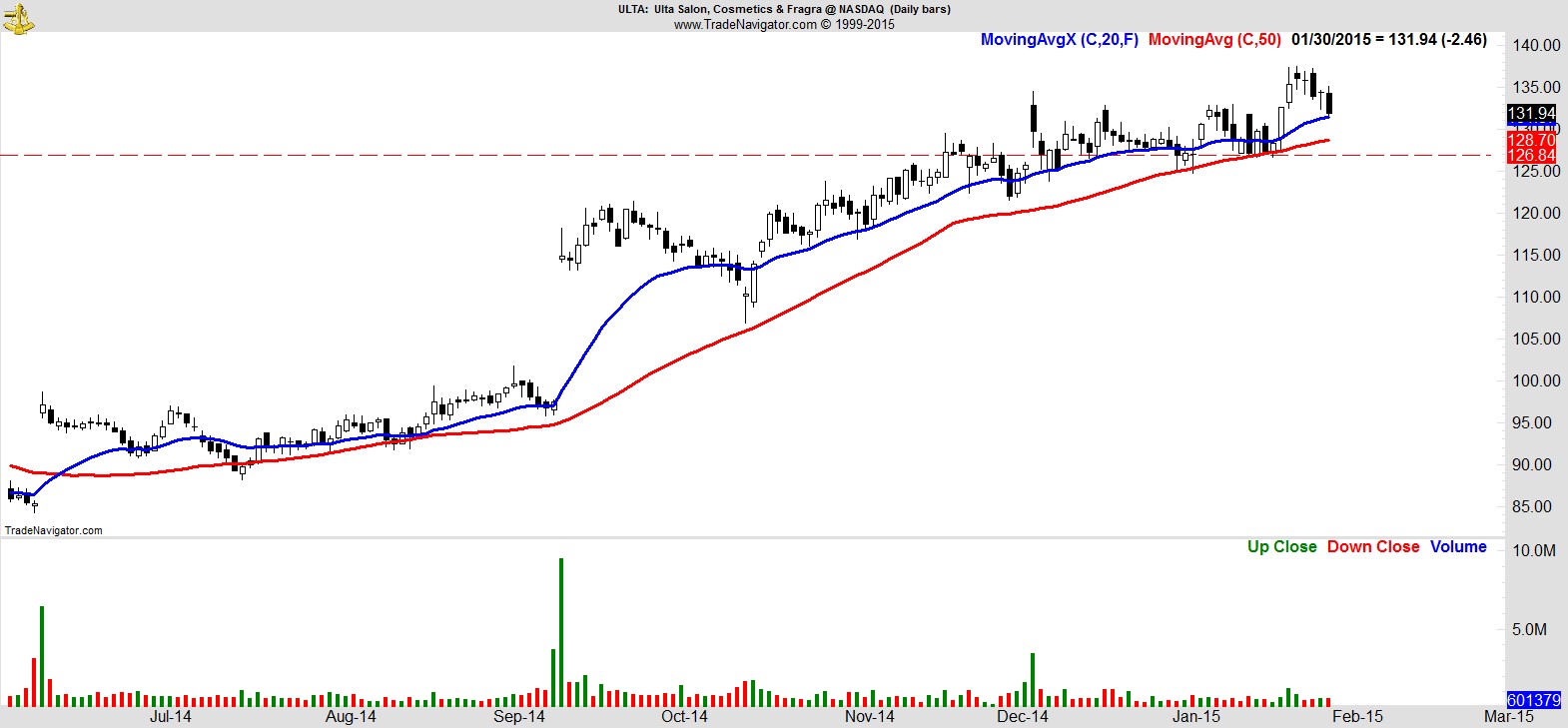
.
$SBH
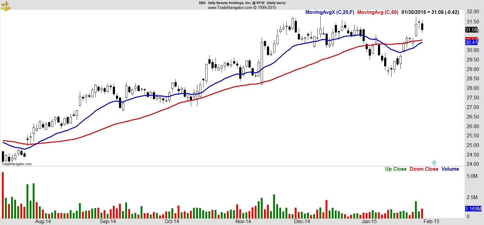
.
Recent free content from Jon Boorman
-
 Weekend Review and Watchlist
— 9/30/17
Weekend Review and Watchlist
— 9/30/17
-
Weekend Review and Watchlist
— 9/22/17
-
Weekend Review and Watchlist
— 9/17/17
-
Weekend Review and Watchlist
— 9/10/17
-
Weekend Review and Watchlist
— 9/02/17